7.3 Every sample gives a different line
We have one sample and one line. What would a different sample have given?
Section 6.6 showed two sections of thirty students producing slopes of 0.300 and 0.162. That was a demonstration with two samples. Let us do it properly.
Draw forty students at random from the 680, fit a line, record the slope. Then do it again. And again, five hundred times.
set.seed(1)

draw_line <- function(n = 40) {
  samp <- students[sample(nrow(students), n, replace = TRUE), ]
  coef(lm(sem_gpa ~ attendance, data = samp))
}

many <- t(replicate(100, draw_line()))
colnames(many) <- c("intercept", "slope")

ggplot(students, aes(attendance, sem_gpa)) +
  geom_point(alpha = 0.08, colour = book_palette$ink, size = 0.9) +
  geom_abline(data = as.data.frame(many),
              aes(intercept = intercept, slope = slope),
              colour = "grey55", linewidth = 0.3, alpha = 0.6) +
  geom_abline(intercept = coef(fit)[1], slope = coef(fit)[2],
              colour = book_palette$reject, linewidth = 1.2) +
  labs(x = "Classes attended", y = "Semester GPA") +
  theme_book()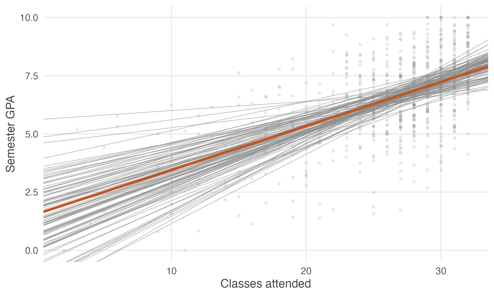
Figure 7.3: One hundred fitted lines, each from a different random sample of forty students, in grey. The line fitted to all 680 students is in orange. Every sample gives a different answer.
Every grey line came from the same population. None of them is the population regression function, and a researcher holding any one of them would have no way of knowing how far off it was.
This is the situation of Unit 2, with a slope in place of a mean.
\(\hat{\beta}_1\) is computed from a sample, so it is a random variable. It has a distribution across the samples that might have been drawn, and that distribution is what tells us how much to trust the one estimate we have.
Looking only at the slopes
Discard the lines and keep the numbers. Five hundred samples give five hundred slopes.
set.seed(1)
slopes <- replicate(5000, draw_line()["attendance"])

ggplot(data.frame(slope = slopes), aes(slope)) +
  geom_histogram(bins = 45, fill = book_palette$fill, colour = "white",
                 linewidth = 0.2) +
  geom_vline(xintercept = coef(fit)[2], colour = book_palette$reject,
             linewidth = 1) +
  labs(x = expression(hat(beta)[1]), y = "Number of samples") +
  theme_book()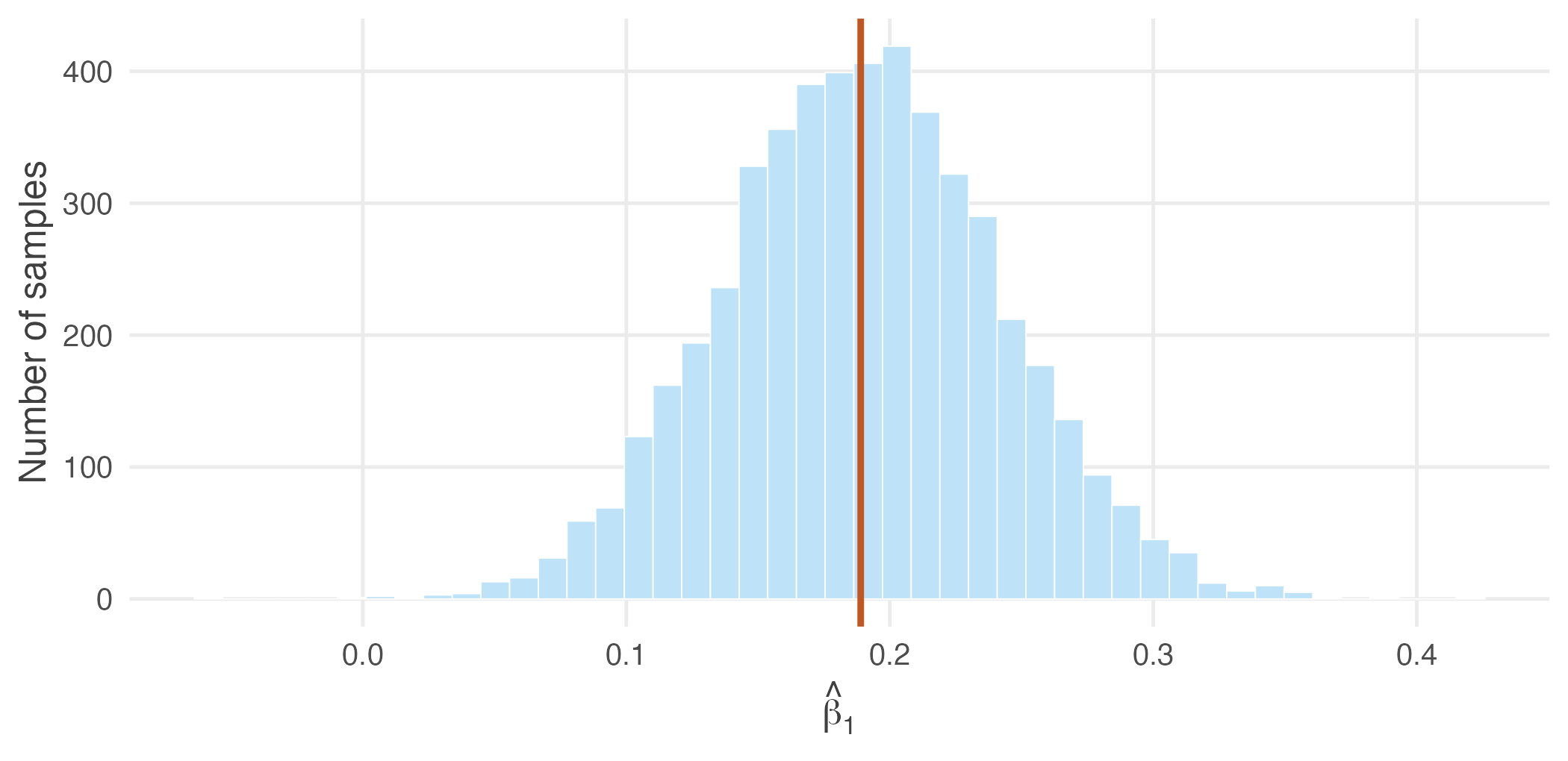
Figure 7.4: The sampling distribution of the slope: 5,000 slopes, each from a fresh sample of forty students. The orange line marks the slope from all 680 students. The distribution is centred on it and roughly symmetric.
That histogram is the sampling distribution of \(\hat{\beta}_1\), and it is the central object of this section. Two features of it matter.
round(c(centre_of_distribution = mean(slopes),
        spread_of_distribution = sd(slopes),
        slope_from_all_680     = coef(fit)[2]), 4)
#> centre_of_distribution spread_of_distribution
#> 0.1895 0.0526
#> slope_from_all_680.attendance
#> 0.1890It is centred on the right place. The average of the five thousand slopes is 0.190, against 0.189 from the full data. No individual sample got it exactly right, and the average of them did.
It has a spread, and that spread is 0.0526.
The standard error of \(\hat{\beta}_1\) is the standard deviation of its sampling distribution.
That is the same definition as in Unit 2, where the standard error of \(\bar{X}\) was the standard deviation of its sampling distribution. The estimator has changed; the idea has not.
The parallel is worth setting out in full, because everything that follows in this unit is the second column of a table whose first column the reader already knows.
| Unit 2–4 | This unit |
|---|---|
| One sample gives one \(\bar{x}\) | One sample gives one \(\hat{\beta}_1\) |
| Repeat the sampling | Repeat the sampling |
| Sampling distribution of \(\bar{X}\) | Sampling distribution of \(\hat{\beta}_1\) |
| \(E(\bar{X}) = \mu\) | \(E(\hat{\beta}_1) = \beta_1\) |
| \(\mathrm{Var}(\bar{X}) = \sigma^2/n\) | \(\mathrm{Var}(\hat{\beta}_1) = \;?\) |
| \(\mathrm{se}(\bar{X}) = \sigma/\sqrt{n}\) | \(\mathrm{se}(\hat{\beta}_1) = \;?\) |
| Confidence interval for \(\mu\) | Confidence interval for \(\beta_1\) |
| \(t\)-test of \(H_0: \mu = \mu_0\) | \(t\)-test of \(H_0: \beta_1 = 0\) |
Nothing in the right-hand column is a new idea. What remains is to fill in the two question marks.
What makes the distribution narrow?
Before deriving anything, we can find out by experiment. Three things plausibly matter: how many students we draw, how spread out their attendance is, and how noisy grades are around the line.
Take the first two in turn.
set.seed(1)
sd_at <- function(n) sd(replicate(2000, draw_line(n)["attendance"]))

round(sapply(c(20, 40, 80, 160, 320), sd_at), 4)
#> [1] 0.0796 0.0525 0.0363 0.0242 0.0179Larger samples give a tighter distribution, and the pattern is familiar: each quadrupling of \(n\) roughly halves the spread. That is the \(\sqrt{n}\) rule of Unit 2, arriving again.
Now hold the sample size fixed at forty and change the range of attendance instead. Restrict the pool to students who attended between 24 and 30 classes, so that \(x\) varies far less.
narrow <- students[students$attendance >= 24 & students$attendance <= 30, ]

set.seed(2)
sd_narrow <- sd(replicate(2000, {
  samp <- narrow[sample(nrow(narrow), 40, replace = TRUE), ]
  coef(lm(sem_gpa ~ attendance, data = samp))[2]
}))

round(c(sd_x_full    = sd(students$attendance),
        sd_x_narrow  = sd(narrow$attendance),
        sd_b1_full   = sd_at(40),
        sd_b1_narrow = sd_narrow), 4)
#> sd_x_full sd_x_narrow sd_b1_full sd_b1_narrow
#> 5.4550 1.8949 0.0525 0.1329This is the striking one. The sample size is identical. What changed is that attendance now varies by 1.9 classes instead of 5.5 — and the slope estimate became about two and a half times more variable.
A slope is a rate of change, and rates of change are measured by observing change.
Comparing students who attended 27 classes with students who attended 28 tells you very little about how attendance matters. Comparing those who attended 5 with those who attended 30 tells you a great deal. Spread in the explanatory variable is information, and a study that observes \(x\) over a narrow range will estimate its effect poorly however many observations it collects.
This is also why the median split of Section 6.1 performed so badly. It discarded most of the spread in attendance.
The third determinant, the noise in \(y\) around the line, needs no simulation to believe: if grades were entirely determined by attendance, every sample would recover the same line exactly.
Three things make the sampling distribution of \(\hat{\beta}_1\) narrow.
- A large sample.
- Wide variation in \(x\).
- Little noise in \(y\) around the line.
We have found all three by experiment. The next two sections establish them algebraically, which requires being explicit about what we are assuming.