1.2 Describing variation
Once variation exists, how do we describe it?
Variation is what makes statistics necessary. The next question is equally natural: how do we describe it?
A die has only six possible outcomes, so its behaviour is easy to summarise. Real datasets are rather different. Consider the annual earnings of twenty thousand Indian workers.
#> [1] 20000#> [1] 17773 60847 115739 34834 30784 2068This dataset is simulated, but it closely resembles the earnings distribution observed in large household surveys such as the India Human Development Survey (IHDS). Throughout this book, we will use it to illustrate statistical ideas and methods.
Twenty thousand numbers are too many for anyone to understand by inspection. We need ways of reducing the data without losing its essential features. The first step is simply to look at it.
ggplot(workers, aes(annual_earnings / 1000)) +
  geom_histogram(bins = 60, fill = book_palette$fill, colour = "white",
                 linewidth = 0.15) +
  scale_x_continuous(labels = scales::comma) +
  labs(x = "Annual earnings (₹ thousand)",
       y = "Number of workers") +
  theme_book()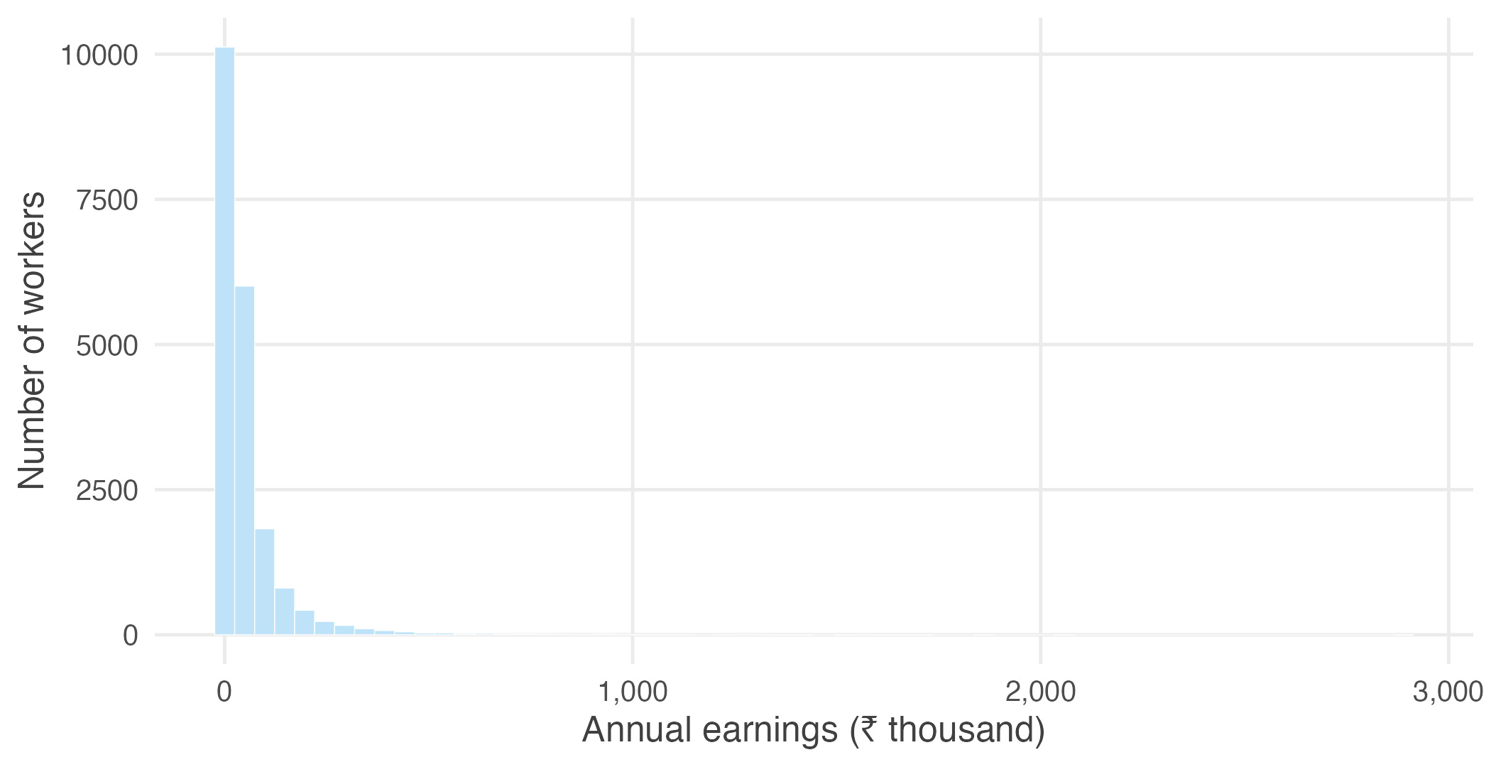
Figure 1.2: Annual earnings of 20,000 Indian workers.
The histogram immediately reveals two important features. Most workers earn relatively modest incomes, while a much smaller number earn substantially more. The distribution is therefore concentrated on the left with a long tail extending to the right — a pattern known as right skewness.
One picture already tells us a great deal, but we can describe the same distribution more precisely using a few numerical summaries.
#>   mean median
#>  54181  24220
The mean annual earnings are more than twice the median. This difference reflects the long right tail visible in the histogram. A relatively small number of high earners pull the mean upwards, whereas the median simply divides the distribution into two equal halves and is much less affected by extreme values.
Variation also concerns how widely observations are dispersed.
#>     sd    iqr
#> 100141  46756
The standard deviation measures the typical distance of observations from the mean, while the interquartile range measures the spread of the middle fifty per cent of the distribution. Together they indicate that earnings vary considerably across workers.
Sometimes we are interested not only in the overall distribution but also in how it differs across groups. A density curve provides a smooth representation of the same data and makes such comparisons easier.
ggplot(workers, aes(annual_earnings / 1000, colour = residence)) +
  geom_density(linewidth = 0.8) +
  scale_colour_manual(values = c(Rural = book_palette$ink,
                                 Urban = book_palette$accent),
                      name = NULL) +
  coord_cartesian(xlim = c(0, 400)) +
  labs(x = "Annual earnings (₹ thousand)", y = NULL) +
  theme_book() +
  theme(axis.text.y = element_blank(),
        legend.position = "top")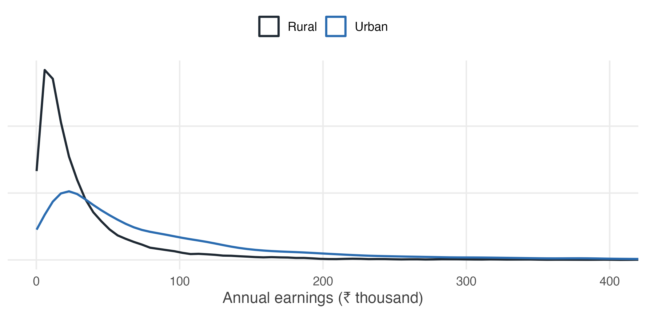
Figure 1.3: Density curves for rural and urban workers.
The entire urban distribution lies to the right of the rural distribution, indicating that urban workers generally earn more than rural workers. The density curve makes this comparison immediately visible without requiring us to examine thousands of individual observations.
By this point, twenty thousand observations have been reduced to a handful of informative summaries: a picture of the distribution, measures of its centre and spread, and a comparison across groups. This is the purpose of descriptive statistics. Rather than examining every observation individually, we summarise the data in ways that preserve its most important features.
Descriptive statistics is always the starting point of a statistical analysis. Before asking whether a result is statistically significant or whether it can be generalised beyond the data at hand, we must first understand what the observed data look like. Only then can we ask the central question of this unit: if we had collected a different sample, would these summaries have been different?