1.6 The Central Limit Theorem
Why do sample means look bell-shaped?
The Law of Large Numbers explains why the sample mean moves closer to the population mean as the sample size increases. It tells us where the sample mean is centred, but not how it is distributed for any given sample size. Without knowing that distribution, we cannot quantify the uncertainty associated with a single survey.
The Central Limit Theorem answers precisely this question. Its remarkable feature is its generality.
Central Limit Theorem. For sufficiently large samples, the sampling distribution of the sample mean is approximately normal, regardless of the shape of the population from which the sample is drawn.
The theorem will be stated more precisely once we have developed the necessary notation. For now, its essential idea is already visible in Figure 1.6. Even when the population itself is far from bell-shaped, the distribution of the sample mean becomes increasingly bell-shaped as the sample size grows.
The strength of this result is easy to underestimate. The population may be binary, highly skewed, or concentrated in only one part of its range. It makes remarkably little difference. Average enough observations together, and the distribution of those averages approaches the familiar bell-shaped curve.
A simulation
The easiest way to appreciate the theorem is to watch it happen. Figure 1.7 compares the sampling distributions of the sample mean for four populations with very different shapes, using sample sizes of one, five and thirty.
set.seed(3)

draw_mean <- function(parent, n) {
  switch(parent,
    "Bernoulli" = mean(rbinom(n, 1, 0.3)),
    "Poisson"   = mean(rpois(n, 2)),
    "Uniform"   = mean(runif(n)),
    "Earnings"  = mean(sample(earn, n, replace = TRUE)))
}

parents <- c("Bernoulli", "Poisson", "Uniform", "Earnings")
sizes   <- c(1, 5, 30)

clt <- do.call(rbind, lapply(parents, function(p)
  do.call(rbind, lapply(sizes, function(n)
    data.frame(parent = p,
               n      = factor(paste("n =", n), levels = paste("n =", sizes)),
               m      = replicate(4000, draw_mean(p, n)))))))

# Standardise within each panel, so all twelve are on one scale and the
# comparison is purely about shape.
clt$z <- ave(clt$m, clt$parent, clt$n,
             FUN = function(x) (x - mean(x)) / sd(x))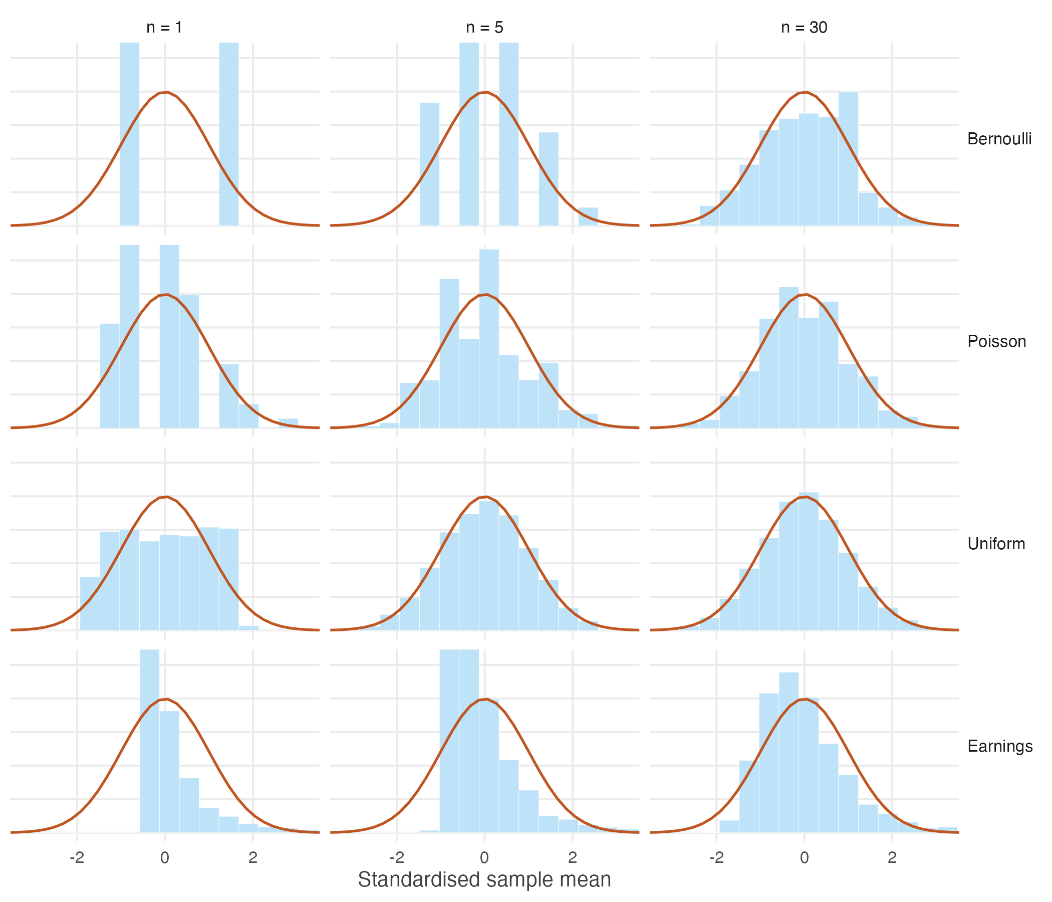
Figure 1.7: Standardised sampling distributions of the sample mean for four populations, against the standard normal curve.
The first column shows the four underlying populations. None resembles a normal distribution. By the third column, however, the distributions of the sample means are all much closer to the familiar bell-shaped curve.
The theorem guarantees that this convergence eventually occurs, but it says nothing about how quickly it happens. Populations that are already fairly symmetric require only modest sample sizes, whereas heavily skewed populations may require substantially larger samples before the normal approximation becomes accurate. In Figure 1.7, the uniform population is already close to normal when \(n = 5\), while the earnings distribution remains visibly asymmetric even when \(n = 30\).
An intuition
Why should averaging observations produce a bell-shaped distribution?
A simple example provides the intuition. Roll a fair die once and every outcome from one to six is equally likely. Now roll two dice and add the results.
#> sums
#>  2  3  4  5  6  7  8  9 10 11 12
#>  1  2  3  4  5  6  5  4  3  2  1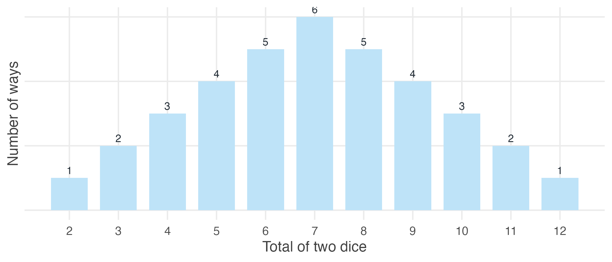
Figure 1.8: The number of ways each total can be obtained when two dice are rolled.
Seven can be obtained in six different ways: \(1+6,\; 2+5,\; 3+4,\; 4+3,\; 5+2,\; 6+1\). By contrast, a total of two can be obtained in only one way. The middle values have many more possible combinations than the extremes, so they occur more frequently.
The same intuition extends far beyond dice. To obtain an unusually large average, most observations must themselves be unusually large. Likewise, an unusually small average requires most observations to be unusually small. Both situations are relatively rare. A value close to the middle, however, can arise from countless combinations of larger and smaller observations offsetting one another.
As more observations are averaged together, the number of ways to obtain values near the centre grows much faster than the number of ways to obtain values at the extremes. The result is the familiar bell-shaped distribution.
How large is “large enough”?
Many textbooks suggest that a sample size of at least thirty is sufficient for the Central Limit Theorem to provide a good approximation. This is a useful rule of thumb, but it is not a mathematical guarantee.
How quickly the approximation becomes accurate depends largely on the shape of the population. Populations that are approximately symmetric require relatively few observations, whereas heavily skewed populations often require much larger samples.
set.seed(9)

skewness <- function(x) mean((x - mean(x))^3) / sd(x)^3

sizes <- c(5, 30, 100, 500)

sk <- c(population = skewness(earn),
        sapply(sizes, function(n)
          skewness(replicate(2000, mean(sample(earn, n, replace = TRUE))))))
names(sk)[-1] <- paste0("n=", sizes)

round(sk, 2)
#> population n=5 n=30 n=100 n=500
#> 7.32 2.99 1.20 0.76 0.27The earnings distribution used throughout this chapter has a skewness of approximately 7.3. When the sample size is five, the sampling distribution remains strongly right-skewed. Even at thirty observations, some asymmetry is still visible. By one hundred observations, however, the distribution is much closer to symmetric.
This matters because many economic variables — including incomes, firm sizes, land holdings and city populations — are themselves highly skewed. For such variables, the normal approximation may still be poor when the sample size is only thirty. In these situations, larger samples or simulation-based checks are often preferable to relying mechanically on a rule of thumb.
Why this matters
The Central Limit Theorem, together with the Law of Large Numbers, explains why statistical inference is possible.
The Law of Large Numbers tells us that repeated samples become increasingly centred on the population mean as the sample size grows. The Central Limit Theorem tells us that the distribution of those sample means approaches a normal distribution. Together, these results reveal that although different samples produce different answers, those answers are not arbitrary. They vary in systematic and predictable ways.
This insight lies at the heart of inferential statistics. We observe only one sample, but by understanding how the same statistic would behave across many hypothetical samples, we can quantify the uncertainty associated with the sample we actually observe.
So far we have developed these ideas largely through intuition, simulation and visualisation. The next section introduces the notation and concepts needed to express them more precisely and to build the methods of statistical inference developed in the remainder of this book.